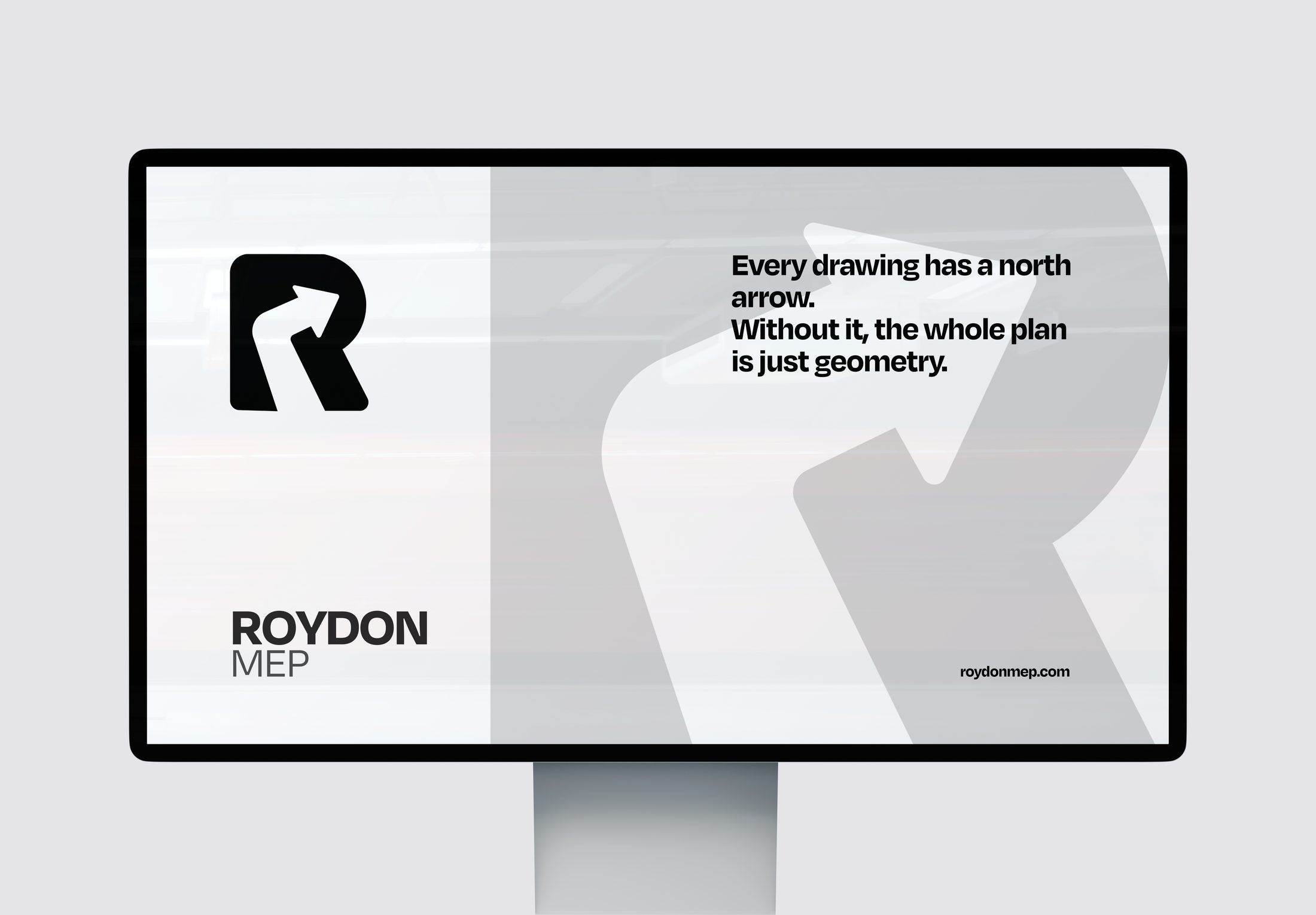
In engineering, true north is the fixed direction every coordinate is measured against. Buildings orient to it. Mechanical layouts route against it. Site plans depend on it. Roydon is that reference — the partner developers and architects steer by when the project gets complicated.
This is the brand for the Roydon that leads a project, not follows it. The Roydon that clients call when they don't know which direction the building should take next. The Roydon whose judgement becomes the reference everyone else aligns to.
The R carries an arrow inside it — not placed on top, but built into its geometry. Direction is not added to the brand. Direction is the brand.
A bold, rounded R. An arrow carved through its interior, moving up and to the right — the direction of every north indicator on every drawing. The R and the arrow are one shape, not two. We cannot separate direction from Roydon — that is the entire point.
Navy replaces black to signal leadership without heaviness. Electric blue is the signal colour — used sparingly, but when it appears, it means forward motion. The palette is designed to work beautifully in animation.